Introduction
Expanding on the previous lab, the goal of this assignment was to develop a webpage that is responsive to mobile applications. The benefit of having a mobile responsive webpage is that it allows the end-user to access the webpage's content from multiple platforms- keeping the client satisfied with your product. Using pieces of code from ArcGIS API for JavaScript and DOM*, the results of this lab were: a places, addresses, congressional districts, senators' information, and higher education search application; and a query application that returns graphical and text information for Wisconsin counties.
Methods
Part 1 - Section I
To start these objectives, an HTML document was created. This document references the necessary ArcGIS JavaScript stylesheets, viewport for iOS and Android mobile responsiveness, and some CSS code for map and search widget styling (figure 1).
 |
| Figure 1: Search app HTML document. |
Next, a JavaScript document was created which references the
Map, Search, FeatureLayer, and
InfoTemplate dojo libraries. Within the functions shown in figures 2 and 3, various parameters are set to ensure the objects display and function properly.
 |
| Figure 2: Search app JavaScript document. |
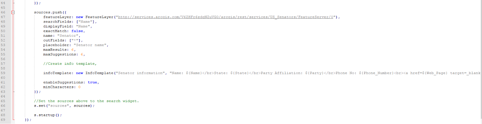
 |
| Figure 3: Search app JavaScript document continued. |
With the two documents working together, the code produced a search application site for end-users to search congressional districts, senators, and geocode addresses (see results).
Part 1 - Section II
For the next section of this activity, the code generated in section one was modified to support a universities search service instead of senators. To achieve this, a shapefile containing location information of universities in the U.S. was published to the local UW-Eau Claire geography server (see Lab 2). Then, that service URL was referenced in the JavaScript document (figure 4).
 |
| Figure 4: Search app with universities JavaScript document. |
The beginning part of the .js code was the same as in section 1 (see figure 2). As with the JavaScript code, a copy of the HTML document from section 1 was made and edited to reference the new JavaScript document (figure 5).
 |
| Figure 5: Search app with universities HTML document. |
The application was then launched in a web browser and provided a search option for universities instead of senators (see results section).
Part 2
For the next part of this lab, a query app which allows end-users to visualize how the populations of each county in Wisconsin compares to the most populous county in the state. To begin this task, an HTML document was created (figure 6) and referenced the appropriate styling sheets, the associated JavaScript document, and the associated CSS document.
 |
| Figure 6: HTML document. |
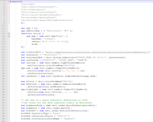
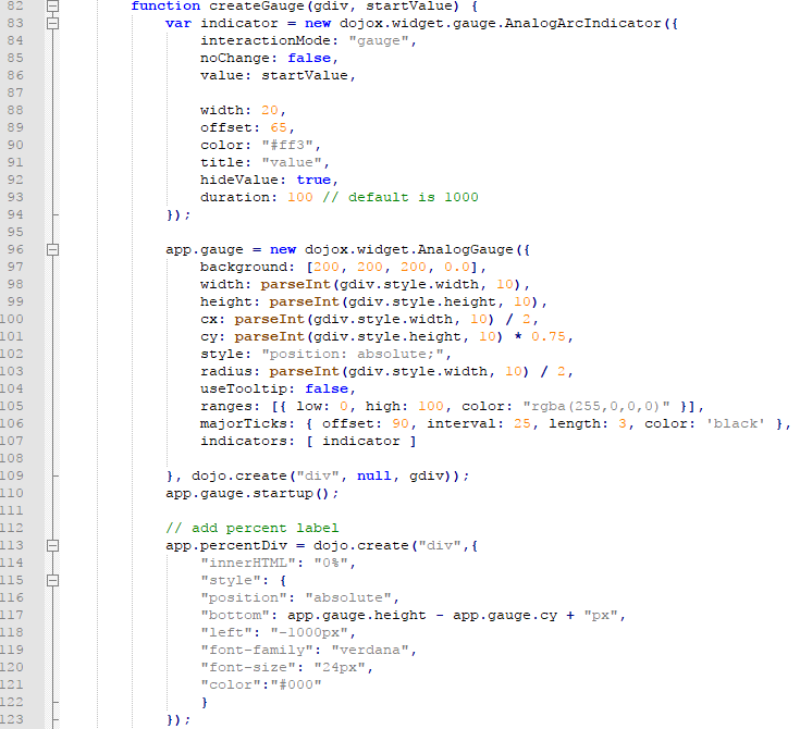
Then, the JavaScript document (figure 7) was used to establish connections to the appropriate dojo libraries, all of the API and predeveloped application functions, and dynamic graphics to display the data.
 |
| Figure 7: JavaScript document. |
Lastly, a CSS document was made (figure 8) to establish the aesthetic properties of the dynamic gauge infographic and webpage containers.
 |
| Figure 8: CSS document. |
The HTML code was launched in a web browser and displayed a well-designed query service (see results section).
Results
 |
| Figure 9: Resulting web application. |
As seen in figure 9, the resulting application is visually and functionally pleasing. The most populous county in Wisconsin is Milwaukee county of course, so when the end-user hovers over Dane county (figure 9), they can see that the county has 51% of the population that Milwaukee county has.
Creating this app was a bit tedious and required a lot of details for such a dynamic data info graphic, but the result turned out superb. Using the dynamic info graphics from ESRI in a web application can really make it appear more sophisticated and provide some exciting data visualization for the end-user.
Sources
Zach Miller
Dr. Cyril Wilson
ArcGIS API for JavaScript


No comments:
Post a Comment